What Makes A Sign Design Impossible To Ignore On A Busy Houston Street?
April 4, 2026
Why Houston Streets Demand Attention-Grabbing Signs
Houston does not slow down for anyone. Traffic stays busy, storefronts compete for attention, and visual noise fills every direction. A business only gets a split-second chance to make an impression before someone drives past or walks away.
A sign has to work fast. It has to cut through chaos, stand out against competing visuals, and deliver a message instantly. If it hesitates even slightly in doing that job, it disappears into the background.
This is where design stops being decoration and becomes survival. A strong sign pulls attention even in a crowded street filled with billboards, neon lights, moving cars, and flashing screens.
The Psychology Behind Eye-Catching Signage
How the Brain Processes Visual Noise
The human brain is constantly filtering information. On a busy Houston street, thousands of visual signals compete at the same time. The brain cannot process everything, so it ignores what looks familiar or unimportant.
That filtering system is exactly what signage must overcome. A sign must break patterns. It must feel different enough to force the brain to stop and notice.
Sharp contrast, bold structure, and clear messaging trigger that reaction. Without them, the brain deletes the sign instantly.
First Impressions in Less Than a Second
People do not study signs, they scan them. In less than a second, the mind decides if something is worth attention.
That moment is everything.
If a message is unclear, crowded, or visually weak, the viewer moves on without a second thought. Strong signage uses simplicity and clarity to win that split-second decision.
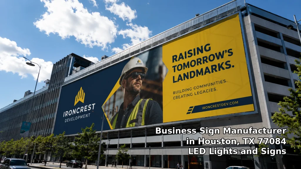
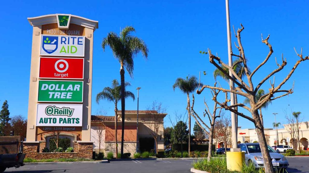
The Visual Chaos of Busy Houston Streets
Competing Stimuli in Urban Environments
Houston streets feel alive at all times. Cars move in every direction, LED boards flash advertisements, and storefronts line every block with competing visuals.
A sign is not competing against silence. It is competing against motion, light, sound, and constant movement.
That means average design gets buried quickly. Only strong visual hierarchy survives the environment.
Why Most Signs Get Ignored
Most signs fail because they try to say too much or look too complicated. Small fonts, weak lighting, and cluttered layouts force the brain to work too hard.
People do not work harder to read signs, they simply ignore them.
A sign that communicates instantly always wins over one that needs interpretation.
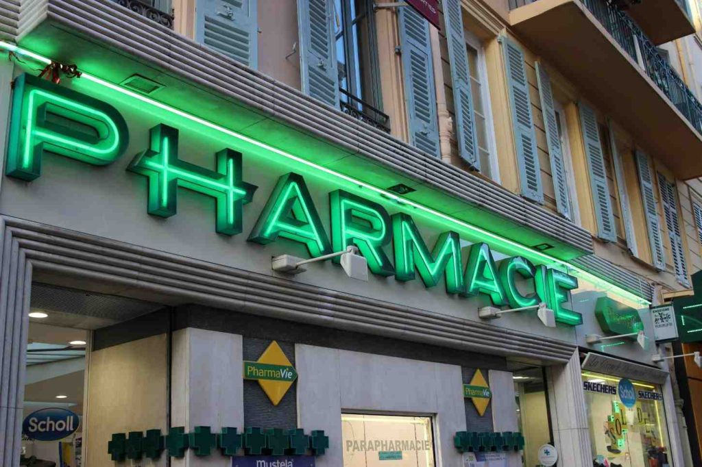
Lighting as the Core of Visibility
LED Dominance in Modern Signage
Lighting is the backbone of visibility. Without it, even the best design disappears at night or under harsh sunlight.
LED technology changed everything. It delivers strong brightness, energy efficiency, and consistent visibility across all conditions.
On Houston streets, where night activity is just as intense as daytime traffic, LED lighting keeps signage alive around the clock.
Day vs Night Visibility Challenges
Daylight washes out weak colors and soft lighting. Nighttime introduces competing neon lights, headlights, and digital screens.
LED systems solve both problems by controlling brightness and contrast. They stay readable in direct sun and still shine clearly after dark.
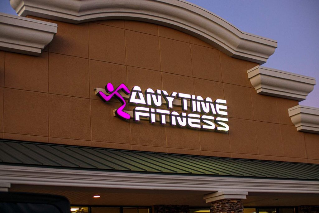
Typography That Stops People Mid-Step
Font Weight and Readability
Typography carries the message. If the font fails, the message fails.
Thin or decorative fonts collapse under distance and motion. Bold, clean lettering holds shape and remains readable even from moving vehicles.
On Houston roads, readability is not optional, it is essential.
Letter Spacing and Scale
Spacing between letters affects clarity more than most people realize. Tight spacing creates visual clutter. Wide spacing improves recognition speed.
Scale also plays a major role. Small text disappears quickly in fast traffic zones. Large, well-proportioned lettering ensures instant understanding.
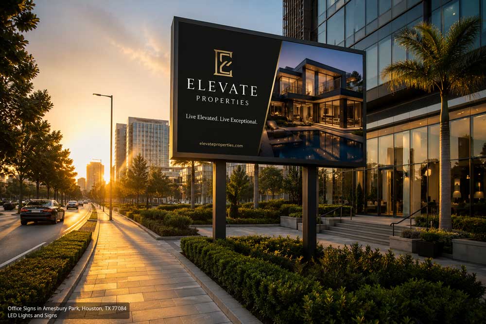
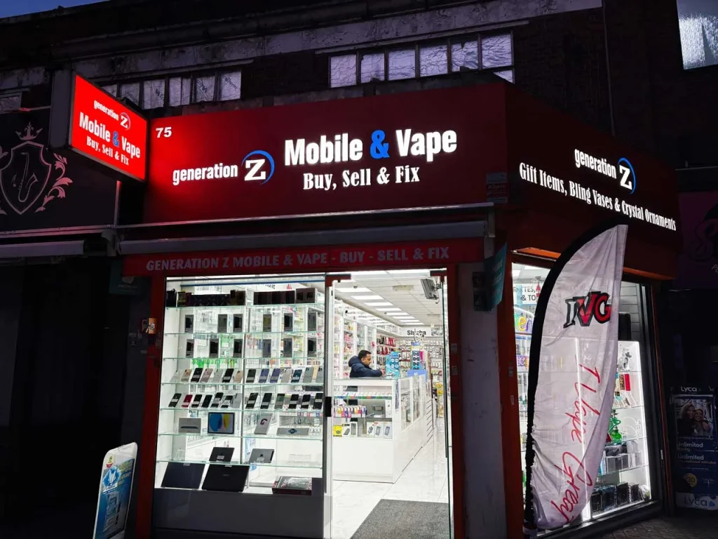
Color Psychology in High-Traffic Areas
High Contrast Combinations
Color contrast decides whether a sign blends in or stands out.
Black and yellow, white and red, or dark backgrounds with bright lettering create instant separation from surroundings.
Without contrast, even bright colors lose impact.
Emotional Triggers Through Color
Color influences emotion before logic kicks in.
Red creates urgency and excitement. Blue builds trust and calmness. Yellow grabs attention quickly. Green signals stability and comfort.
A strong sign uses color with purpose, not decoration.
Motion and Dynamic Displays
Why Movement Captures Attention
The human eye naturally follows movement. Even slight animation can redirect attention away from surrounding distractions.
On busy Houston streets, motion acts like a magnet. It interrupts scanning patterns and forces a second look.
When Animation Becomes Overkill
Too much motion creates confusion. Flashing lights and rapid transitions overwhelm the viewer instead of helping them.
Controlled animation works better. Smooth transitions and minimal movement keep attention without creating chaos.
Contrast Against the Environment
A sign must fight its surroundings, not disappear into them.
Dark signage against bright walls or glowing text on muted backgrounds improves visibility instantly.
Contrast is not just color-based, it includes brightness, shape, and spacing.
Readability at a Distance
Distance changes everything.
A pedestrian standing nearby reads details. A driver passing at 40 miles per hour only sees shapes and large text.
Strong signage accounts for both situations. It uses hierarchy, big headline text for quick reading and minimal supporting information.
If a sign cannot communicate from a distance, it loses value on a busy street.
Branding Consistency and Recognition
Recognition builds trust faster than explanation.
When a brand uses consistent colors, typography, and layout style, people recognize it instantly without reading.
In Houston’s crowded visual environment, recognition saves time and builds familiarity. Familiarity drives repeat engagement.
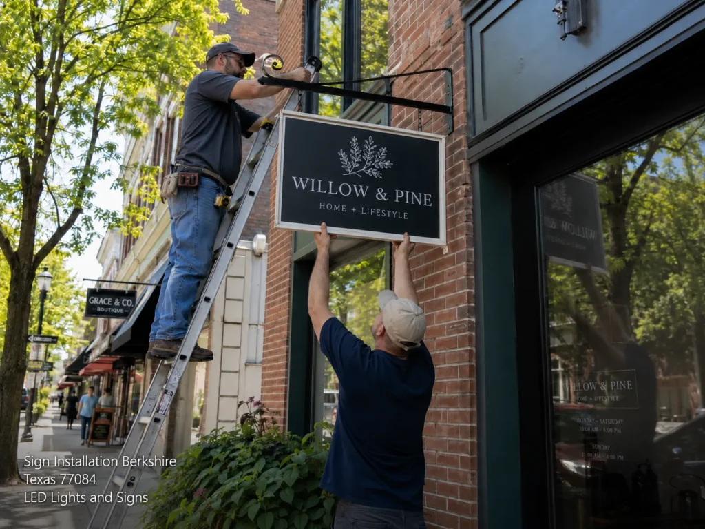
Strategic Sign Placement in Amesbury Park
Placement often decides success more than design.
A sign placed too high loses street-level visibility. Too low, and vehicles block it. Wrong angle, and pedestrians miss it completely.
Traffic flow matters too. A sign facing incoming traffic gets more impressions than one facing away from it.
Good placement turns a decent sign into a powerful attention tool.
Weather Resistance and Material Durability
Houston weather is not gentle. Heat, humidity, rain, and storms all take a toll on outdoor signage.
Materials must resist fading, warping, and electrical wear. Lighting systems must stay stable under changing conditions.
A sign that looks good on day one but fades in months loses its value fast. Durability protects both appearance and investment.
Common Design Mistakes That Kill Visibility
Many signs fail for simple reasons:
- Too much text that slows down reading
- Weak lighting that blends into surroundings
- Poor font choices that reduce clarity
- Low contrast color combinations
- Overcrowded layouts with no focus point
Each mistake reduces attention span. In a busy street, reduced attention equals lost customers.
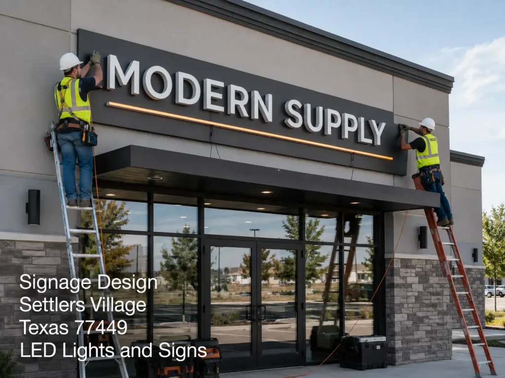
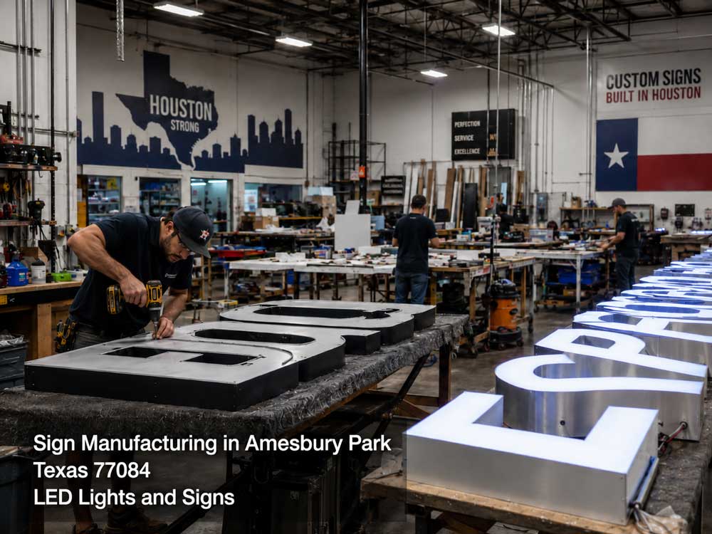
LED Lights and Signs
Crafting High-Impact Commercial Signage in Houston
LED Lights and Signs focuses on building signage that performs in real Houston conditions. That means designing for heavy traffic, strong sunlight, nighttime visibility, and constant urban competition.
Every project centers on clarity first. Lighting systems stay bright without being harsh. Typography stays readable without clutter. Color choices support fast recognition instead of decoration.
The goal is simple: make businesses visible in seconds, not minutes.
In a city like Houston, visibility is not a luxury. It is a competitive advantage. LED Lights and Signs helps businesses secure that advantage through thoughtful design and high-performance LED technology built for real street conditions.
Real-World Impact on Houston Businesses
Strong signage directly affects customer behavior. A clear, bright sign increases foot traffic, improves brand recall, and strengthens trust before a customer even enters the store.
On a busy Houston street, attention turns into opportunity. Businesses that invest in visibility often see stronger engagement simply because more people notice them.
LED Lights and Signs Serving the Amesbury Park Community and Beyond in Houston
LED Lights and Signs is dedicated to serving the diverse needs of the local community of Houston, including individuals residing in neighborhoods like Amesbury Park. With its convenient location near landmarks such as the Steve Radack Community Center and major intersections like Clay Rd & Oak St (coordinates: 29.8316824, -95.6878096), we offer event signage Houston services.
Get Event Signage Services at Amesbury Park Now
Navigate from Amesbury Park to LED Lights and Signs Now
Design That Commands Attention in the Middle of Houston’s Visual Chaos
A sign becomes impossible to ignore when it understands its environment.
Houston streets demand speed, clarity, contrast, and strong lighting. Design alone does not win attention, execution does.
Every detail matters: typography, color, placement, brightness, and durability all work together. When these elements align, a sign does more than display a name. It pulls people in, even in the middle of visual chaos.
FAQs
1. What makes a sign stand out in Houston traffic?
Strong contrast, bright LED lighting, simple messaging, and large readable fonts make a sign noticeable in busy traffic.
2. Why is LED lighting important for signage?
LED lighting improves brightness, visibility, and energy efficiency, making signs readable both day and night.
3. How many words should a sign have?
Short messaging works best. Most effective signs use only a few words that communicate instantly.
4. Why do some signs fail even if they look good?
Poor placement, weak lighting, or cluttered design can make even attractive signs hard to notice.
5. How does placement affect sign performance?
Placement controls visibility. A sign facing traffic at eye level gets more attention than one hidden or angled poorly.

Recent Blogs
4 Signage Design Choices That Make A Business Look Instantly Credible In Settlers Village
Customers often decide how they feel about a business within seconds of seeing it. A clean, professional sign can create trust before someone walks inside. Good signage design helps businesses show their personality, improve recognition, and create a strong first impression. A well-planned sign tells customers that a company cares about quality, details, and professionalism….The Material Inside Sign Manufacturing Matters More Than the Design. Amesbury Park
A beautiful sign catches attention, but the real value comes from what people cannot see. Good sign manufacturing starts with strong materials that help a sign stay bright, safe, and reliable for years. A great design can attract customers, yet poor materials can cause fading, cracks, or rust long before the design loses its appeal….7 Sign Placement Mistakes That Make Customers Drive Right Past You. Berkshire
Why Sign Placement Matters More Than You Think A sign is often the first thing people notice about a business. Drivers make quick choices in just a few seconds. If they do not see your sign clearly, they move on without stopping. Many businesses in Berkshire lose customers this way without even realizing it, especially…
Free Phone Consultation
Explore our range of High-quality signage solutions tailored just for you. From eye-catching LED displays to elegant custom signs, we’ve got you covered. Plus, take advantage of our FREE PHONE CONSULTATION to discuss your needs and get started today! Simply reach out to us by dialing (281) 235-3242.
